School Website Templates & Designer
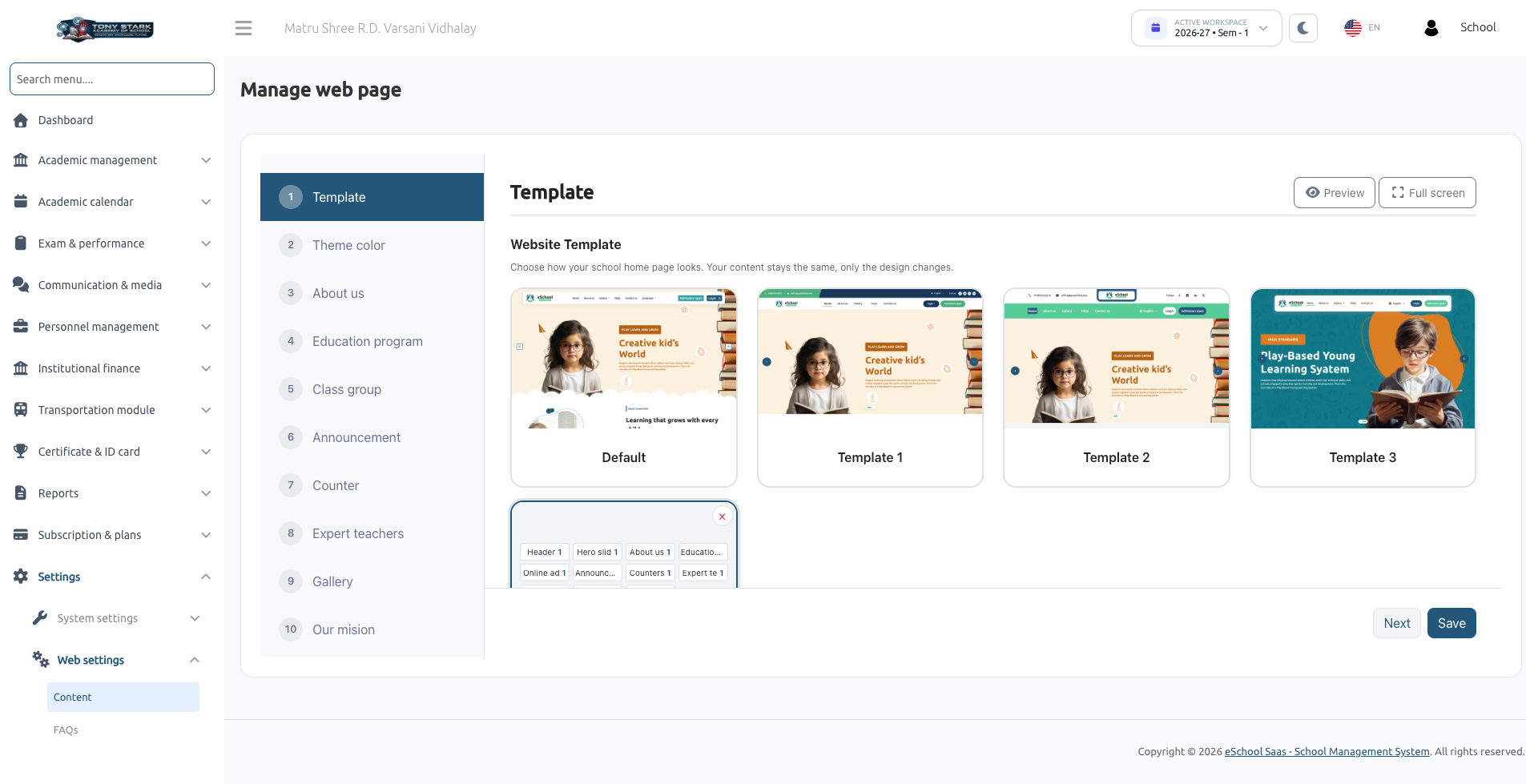
Every school in e-School SaaS comes with an integrated public-facing website. The Website Templates & Designer empowers school administrators to customize their website's aesthetic, choose ready-made templates, mix and match section layouts, set school brand colors, and preview updates across devices without any coding knowledge.
All website appearance, color schemes, and section content are configured from a single intuitive screen in the school admin panel: Settings → Web settings → Content (Manage web page).
1. Feature Capabilities
With the Website Templates & Designer, you can:
- Choose a Full Website Template: Pick from ready-made template designs (Default, Template 1, Template 2, Template 3) or your own custom templates.
- Mix & Match Section Variations: Every section of the home page (such as About us, Counters, Announcements, Gallery) comes with three distinct design variations. You can independently show, hide, or pick the design variation for each section.
- Save Custom Templates: Save your favorite combination of section designs as a reusable template (e.g., "Festival Look", "Admission Season Theme").
- Customize Brand Colors: Set primary, secondary, background, and button hover colors applied across the website.
- Live Multi-Device Preview: Preview changes in real time on desktop, tablet, and mobile dimensions before saving.
- Non-Destructive Design Changes: Switching templates or section variations changes only the visual presentation; all text, pictures, and links remain intact.
2. Prerequisites & Plan Requirements
To access and configure web settings:
- Your school subscription package must include Website Management.
- Your staff role must have permissions to manage website settings.
Module Dependencies
Certain sections depend on specific modules in your school plan:
| Section | Required Plan Module | Behavior if Module is Not in Plan |
|---|---|---|
| Hero Slider (Rotating banners at top) | Slider Management | Slider simply does not appear on the website. |
| Gallery (Photo & video albums) | School Gallery Management | Displays "This feature is not included in your current package"; cannot be toggled on. |
| Announcements (Notice board) | Announcement Management | Displays "This feature is not included in your current package"; cannot be toggled on. |
3. Quick Start: Update Your Website Look in 60 Seconds
- Navigate to Settings → Web settings → Content. The Template step opens by default.
- Under Website Template, click the card for the design you want (e.g., Template 2).
- Click Preview in the upper right to inspect your website with the new design.
- Test responsiveness by switching between Desktop, Tablet, and Mobile view modes, then click Close.
- Click Save at the bottom of the step.
- Open your school's public website in another browser tab and refresh to see the new look live!
4. Choosing a Website Template
On Step 1 (Template), the Website Template section presents ready-made design cards:
- Default: The original, classic school website design. Its section layouts are fixed. When selected, the section variation dropdowns are locked, though section show/hide switches remain fully functional.
- Template 1: A modern, vibrant layout with engaging rounded cards and balanced content blocks.
- Template 2: A structured, card-based layout featuring rich hover reveal effects (e.g., class group descriptions expand when hovered) and dedicated counter graphics.
- Template 3: A sleek, elegant layout with prominent typography and clean visual hierarchy.
- Custom Templates: Any custom combinations you have created, tagged with a Custom badge.
Hover your mouse over any template card. A small eye icon appears in the upper left corner. Click it to preview that template immediately without changing your current on-screen selections.
5. Customizing Home Page Sections & Variations
Below the template cards, the Sections table lists every element of your home page from top to bottom:
| Section | Visibility Condition | Control Method |
|---|---|---|
| Header (Logo & Menu) | Always displayed | Always shown |
| Hero Slider | Slider Management in plan & slider pictures added | Controlled via Sliders menu |
| About Us | Switch enabled | Toggle switch or About us step status |
| Education Programs | Switch enabled and at least one class group created | Toggle switch or Education program step status |
| Online Admission | Switch enabled | Toggle switch or Online registration step status |
| Announcements | Switch enabled and at least one announcement published | Toggle switch or Announcement step status |
| Counters | Switch enabled | Toggle switch or Counter step status |
| Expert Teachers | Switch enabled and at least one staff member added | Toggle switch or Expert teachers step status |
| FAQs | Switch enabled and at least one FAQ created | Toggle switch or FAQs step status |
| Gallery | Switch enabled and at least one album created | Toggle switch or Gallery step status |
| Footer | Always displayed | Always shown |
Showing or Hiding Sections
- Toggle the switch in the Show on website column for any section.
- This switch is synchronized with the Status (Enable / Disable) setting in the section's dedicated content step.
Selecting Section Design Variations
- Open the dropdown in the Design variation column for any section.
- Choose Variation 1, Variation 2, or Variation 3.
- When your combination differs from the selected base template, a yellow Customized badge appears beside the Sections heading.
- Click Save to apply your layout.
6. Saving & Managing Custom Templates
If you have customized a unique combination of section variations:
- In the Template step, adjust the design variations for each section to your preference.
- In the Custom template name field, enter a descriptive title (e.g., Summer Admission Look, Annual Festival Theme) up to 60 characters.
- Click Save as custom template.
- A new template card appears with a Custom badge and becomes active.
- Click Save at the bottom to apply it to your live website.
- You can save up to 10 custom templates. If the limit is reached, delete an unused custom template to free up space.
- A custom template preserves the variation number chosen for each section. It does not alter text, pictures, or colors.
- To delete a custom template, click the × button on its card and confirm. Predefined templates (Default, Template 1–3) cannot be deleted.
7. Interactive Live Preview
The Preview tool lets you experience your website with unsaved edits before committing them live:
- Launch Preview: Click Preview (or Full screen) at the top right of the Template or Theme Color step, or click the eye icon on any template card.
- Device View Modes: Toggle between Desktop, Tablet, and Mobile to test responsiveness across screen sizes.
- Full Screen Mode: Fills your monitor. Press Esc or click Exit full screen to return.
- Preview Safeguard: A "Preview - not saved" indicator confirms that the session is in draft mode. Links and forms are intentionally inactive.
- Use This Template: If previewing from a card, click Use this template to select it directly.
- Click Close when finished.
8. Setting Theme Colors
Open Step 2 (Theme color) to align the public website with your school's official brand palette:
| Color Field | Purpose & Usage | Default Hex |
|---|---|---|
| Primary color | Main brand color for action buttons, headings, and prominent banner cards. | #22577a |
| Secondary color | Accent color for top notification bars, footer banners, and badges. | #38a3a5 |
| Primary background colour | Soft background tint used behind alternating content sections. | #f2f5f7 |
| Text secondary colour | Secondary text color utilized by the Default website. | #2d2c2fb5 |
| Primary hover colour | Darker accent shade displayed when visitors hover over buttons and links. | #143449 |
- Click any color swatch to open the color picker, or enter a standard 6-digit hex code (e.g.,
#22577a). - Click Preview to verify contrast. The system automatically adjusts foreground text between light and dark for readability.
- Click Save to push colors live.
9. Visitor Experience & Interactive Animations
- Hero Slider Random Transitions: In Templates 1, 2, and 3, sliders automatically cycle every 5 seconds using random transition animations (including slide, slide up, fade, zoom in, zoom out, blur, wipe, cube, flip, door, spiral, and tunnel). Visitors who have enabled "Reduce Motion" on their devices receive smooth standard sliding transitions.
- Interactive Micro-Animations: On desktop devices with mouse pointers, cards gently elevate on hover. These effects are automatically optimized for touch devices.
- Global Consistency: The selected template header, footer, typography, and color palette automatically extend to all child pages, including About Us, Gallery, Contact Us, Online Registration, and legal policies.
10. How Saving Works
- Step-by-Step Saving: Clicking Save saves the specific step currently active on screen. The system displays Data Updated Successfully.
- Navigation Validation: Clicking Next advances to the subsequent step and validates that required fields are filled, but does not commit data to the database until you click Save.
- Instant Propagation: Updates appear on your public website immediately upon clicking Save. Simply refresh your browser tab.
Next Steps
To configure text, upload pictures, and set up educational programs, see Website Content & Sections.